.png)
BOOK THIS SPACE FOR AD
ARTICLE AD
Before the online market picked up, companies and small retailers always prioritized the customer experience in their stores. The more memorable a customer’s experience is, the more they will return to you and spread the word to their friends and family. But things have changed now.
According to a survey, over 67% of people have reported that they prefer to make a purchase online rather than offline, especially after the pandemic hit the world in 2019.
Now the organization has an even more challenging job: how to impress the customer online and improve his experience so that he may get the same feeling as offline but without the personal touch, which played a massive role in the process.
This is a tricky but doable task. There are simple steps to follow when the organization is developing a web application or needs to lift its digital experience and match a customer’s expectations.
For this, organizations can leverage manual and automation testing techniques to ensure the online experience is seamless, error-free, and meets customers' expectations. They can also keep in mind the following best practices to ensure a pixel-perfect digital experience.
Keep up with the latest trends
The most important thing to create a seamless digital experience for the web and mobile is to adopt new technologies and trends. These technologies work in two ways for an organization; first, newer technologies are always optimized and more attractive. Second, since competitors start using them, users generally expect them to be on other websites as well.
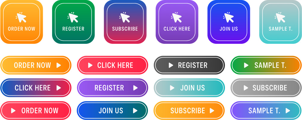
For instance, if we just consider the evolution of buttons on a web page, we were somewhere around this:
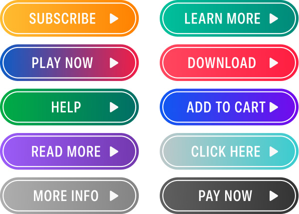
Then to this:
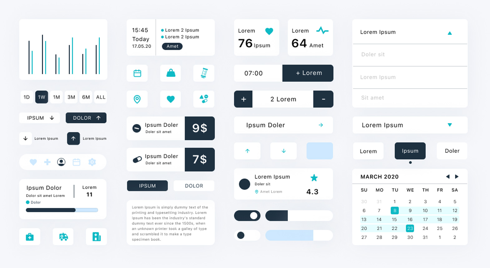
And then to this:
Considering we use the older button styles, it might become the first thing a user would notice, and the first impression could make a difference in their perception of our business.
However, this is just one element of the technology used in the web and mobile applications and is popularly termed as user experience. This expands to animations, transitions, and whatever the user can touch and see on the app that is unique and creative. The second technology that always needs to be kept on par with the latest trends in payment options.
As per a source, globally, 67% of buyers preferred credit or debit cards over cash-based transactions. It has been a growing trend worldwide owing to the transparency of transactions and quick refund services.
By this statistic, we can implement credit and debit card channels and never need to bother about any changes to our /payment URL. But things change drastically when we move from region to region.
For instance, US citizens prefer credit and debit services. As per the research by Fintech, more than 76% of Indian citizens prefer the UPI payment method, and it is a relatively newer technology than card services. So, as an organization, more than just maintaining our user experience is required.
If the user’s preferred payment system is unavailable depending on the region, that could be counted as a bad experience.
Involve user interaction as minimally as possible
Applications and web development trends have all leaned towards reducing a user’s interaction as low as possible. For instance, advertisement agencies take cookies to determine a user’s interest and show them ads from various websites. This generates enormous revenue for them, but that is just because users click on these ads.
When we talk about minimal interaction, we consider two things. The first thing is how much a user types, scrolls, and clicks to achieve what he intends to. The second thing is how much navigation they do to reach from the home screen to the final objective, which in the case of an eCommerce website is considered as “a purchase done successfully.”
Recently artificial intelligence has started to get involved in almost everything that requires prediction, deduction, or mathematical calculation, such as classification. The most obvious benefit of incorporating artificial intelligence is the reduction in the work done by the user.
For instance, earlier users were required to search for everything by typing words in the search box. Today, they can tap the microphone icon and speak out their search query.

Artificial intelligence has also been involved in chatting with customer support using chatbots (reducing repetitive email interactions) and suggesting products to the user based on interest.
Similarly, social media buttons are a popular way to embed on the website that can copy the link of the page, navigate to that particular social media website and sometimes paste the URL on the post section automatically.
Earlier, this process was done by copying the URL, then opening the social media URL and pasting this link on the post section or chat section to your friends manually, etc.
These are, however, just small, simple examples of one type of technology used today. The main goal of exploring this topic is to understand the concept of minimal interaction and maximum expression from our application or website.
If the user can navigate in minimum steps and interact only when it is highly required, it is harder to keep the application out of mind.
Data Consistency on multiple platforms
According to a survey conducted by Pew Research in 2015 for people owning a smartphone, a computer, a tablet, or a combination of these, a whopping 36% of Americans own all three devices. This number jumped to 57% in 2017, marking these cases true, especially when the user is at home.
These statistics raise a minor issue for us as an organization. If the user is operating on multiple devices regularly, they will expect their data to be consistent across all devices.
If we consider an eCommerce website for this, we know that users do not always purchase products instantly. Sometimes they add it to the cart and then continue shopping. Sometimes they make a wish list and buy it later in the future.
What if a user adds an item to the cart on a mobile device but, when proceeding to purchase on the laptop, finds out that the cart is empty? Such types of data inconsistencies spoil the digital experience of the user.
An important task of this magnitude needs rigorous testing and a vast collection of mobile devices to test upon. The major problem the testers face is procuring devices and executing the same tests on multiple devices multiple times.
On top of it, integrating third-party applications also becomes a headache since each of those applications needs to be installed with the correct binary on the operating system.
The best solution to deal with such issues and create a seamless digital experience for web and mobile is to rent out these devices from online digital experience testing platforms such as LambdaTest.
These cloud-service providers do all the heavy job for you, and as a tester, all we need to do is sign up for free, select the target device, and start testing right away. LambdaTest lets you perform manual and automation testing of web and mobile apps across 3000+ real browsers, devices, and OS combinations.
You can also test web and mobile applications in real-world scenarios using its real device cloud.
The procurement of devices, maintenance, and integration with third-party applications is done by these providers themselves. For instance, LambdaTest can provide integration to JIRA directly from the platform. This way, when you are using the platform and encounter any bugs in the process, they can be directly uploaded to JIRA from the platform.
These types of testing techniques ensure that the digital experience will remain consistent across various devices. It also gives confidence to the testers and organization around promoting their application on these important pillars of seamless experiences.
Optimizing everything for mobile
The growth of mobile devices and their usage have all seen a steep rise in the last decade. In 2015, only 31% of the world’s internet traffic came from mobile devices. Today, it is a little shy of 60%.
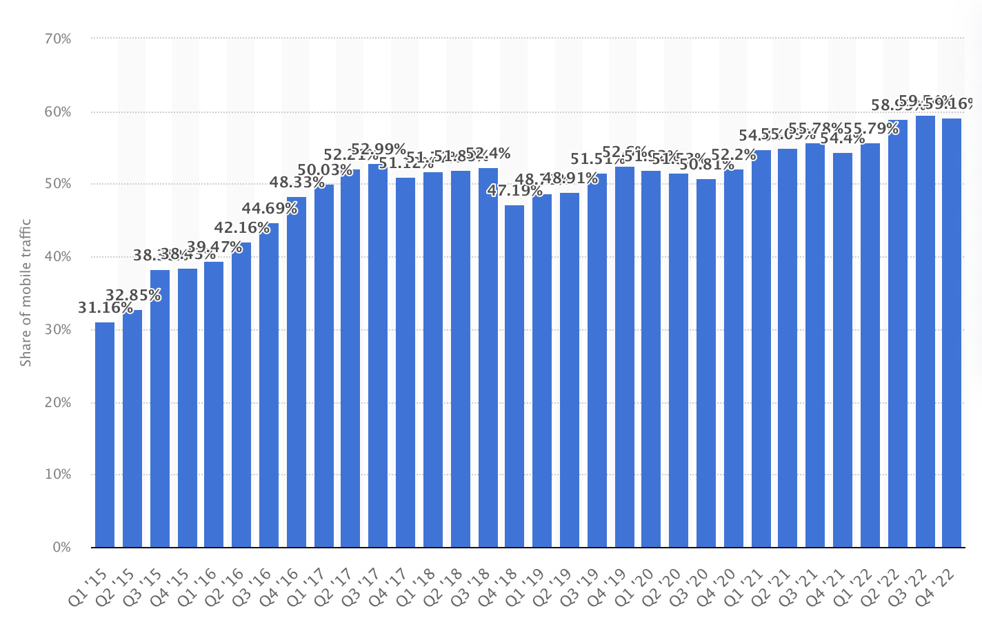 Growth of mobile devices
This means for an organization, mobile devices are more important than other devices, such as laptops. Hence, the development and testing should be shaped according to the mobile devices to create a seamless digital experience for the web and mobile.
Achieving this is not that hard. Currently, we work on mobile-first design techniques that allow us to develop the application first for mobile and then expand it to other devices. This way, we ensure that even if we spill on the desktops, there are no mishaps on a mobile device, and we can cover most of the audience.
Test everything
Finally, there is no assurance of a seamless digital experience for web and mobile until we deliberately try to break things apart. This is what testing the application means in layman’s terms.
Application testing has evolved and optimized in various ways that can today uncover even minor bugs that were hard to point out manually earlier. From UI change detection to self-healing technologies, artificial intelligence has served the user and testers well. Taking advantage of it is one thing we need to do right to have a smooth release.
A few of the testing paradigms include UI testing, usability testing, exploratory testing, compatibility testing (preferably through cross-browser testing tools), API testing, geo-location testing, performance testing, security testing, etc.
Perform web and mobile app testing on a real device cloud. Sign up on LambdaTest for FREE.
Summary
Technologies are evolving every day, and with their evolution, the user’s experience takes different shapes from time to time. What is “trendy” today will become an “old design” or “obsolete method” in a few years (sometimes weeks depending on the type of technology). For developers and testers, it becomes one field that needs constant attention and adoption towards it.
To provide a seamless digital experience for web and mobile, we need to focus on just five areas discussed in this post. Firstly, we should always develop in accordance with the latest trends. If things have changed, consider that they have changed for good. Users love their UX and, most of the time, are quite sensitive about it. Second, keep user interaction as minimal as possible. If users see the work getting done with the minimum input required, they will remember the applications.
Third, if your application is available for multiple platforms, data should be consistent on all of them. If someone uploads a file and then continues on a different device, the file should be visible (in the uploaded state).
Fourth, work on the mobile-first and then grow outward towards large-screen devices. Since mobile users are much more in number, it will make the app perfect for the majority of the audience. Finally, test everything in every way possible to determine the smallest of bugs and let the user experience the application as intended. All these steps make the application seamless and may bear fruitful results if followed.
Sponsored and written by LambdaTest


 Bengali (Bangladesh) ·
  English (United States) ·